Redesigned key features across Venda ERP.
End-to-end redesign of the Venda ERP platform — from the whitelabel partner workspace to the ERP dashboard their clients use every day.
Rethinking a platform that had been patched for years.
Venda ERP is a B2B SaaS platform sold through a partner network. When I joined, the partner panel had been updated year after year without ever being rethought — features stacked on top of a legacy structure, and the experience had drifted far from what partners actually needed day to day.
What started as a focused effort on the partner workspace ended up touching the core of the product — whitelabel customization, license management, new internal tools for partners, and the ERP dashboard and PDV their clients interact with every day.
I worked end-to-end — research, wireframes, UI, design system, developer handoff, and follow-up through implementation — partnering closely with engineering so the work actually shipped.
The partner panel had become obsolete — patched yearly without a cohesive vision, hard to navigate, and visually dated. Partners struggled with onboarding, had a confusing view of payments and client licenses, and had limited room to differentiate their whitelabel version of the product.
- Differentiating Venda ERP from its parent product, SIGE Cloud, without breaking existing users' expectations
- Partners had no autonomy to customize the whitelabel platform themselves
- License management was confusing, generating support tickets and payment disputes
- The dashboard had no visual hierarchy — everything looked equally important
- The PDV had too many steps, causing errors during live sales
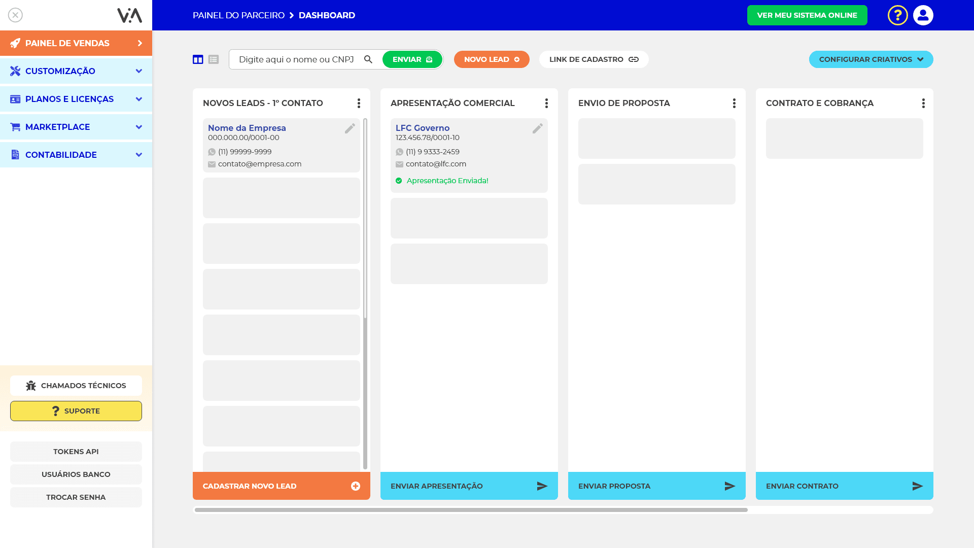
Where partners organize everything — visual-first.
The partner's main workspace. Configuration forms gave way to a visual editor: more options, more differentiation, and no dev support needed to personalize the platform.
Payments, charges and partner clients — readable at a glance.
Partners needed clarity on the money side: what was paid, what was pending, which client held which license. The redesign collapses that into a single, calm surface.
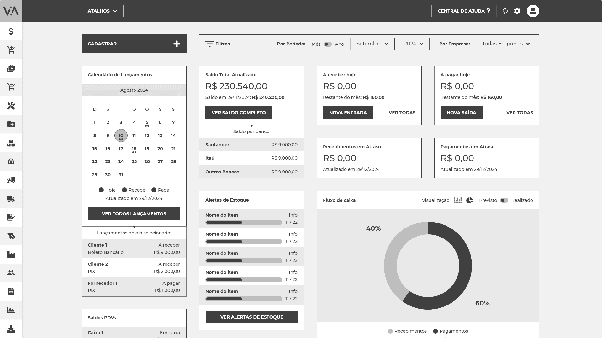
The ERP the partner's clients use every day — modern, and customizable.
This is what the partner sells. Rebuilt from the information architecture up — wireframed first — and now flexible enough for each partner to shape it to their brand.
The end-customer checkout, aligned to the new identity.
With the dashboard rebuilt, the PDV had to follow — consistent patterns all the way from the partner's workspace to the moment a sale closes.
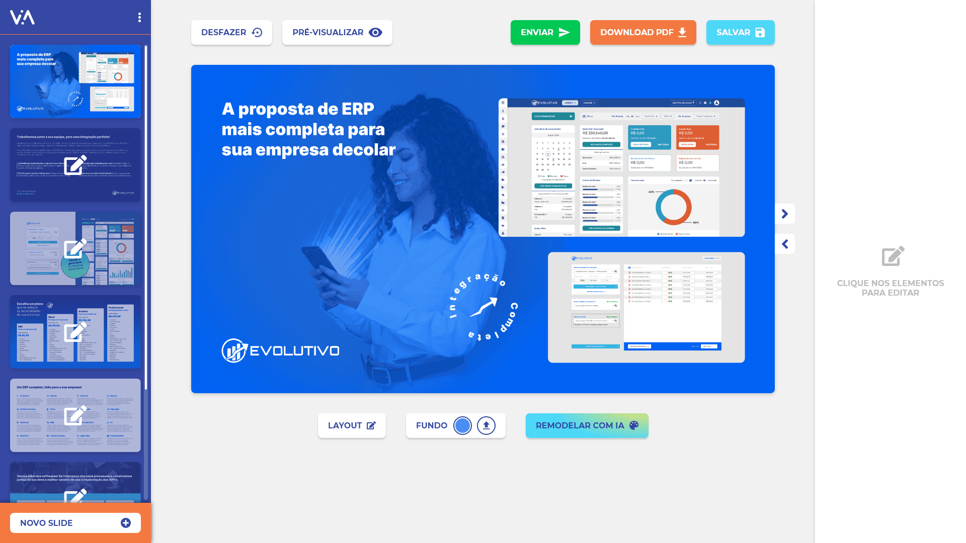
Two new tools, built from the ground up.
Beyond improving what existed, the project opened room for two new surfaces that weren't possible in the legacy panel — a partner lead hub and a whitelabel materials editor.
What shipped.
- Onboarding built from scratch — new leads reach the product faster and experience more of it.
- Stronger engagement from existing partners, with a panel that feels modern and trustworthy again.
- License management simplified — payments, charges and partner clients now readable at a glance.
- Whitelabel customization expanded — partners can truly make the product their own.
- Two new modules shipped: an internal sales tool and a whitelabel materials editor.
- Dashboard and PDV redesigned — the two most-used surfaces of the system.
Enterprise software evolves — it doesn't get replaced.
In complex systems with an established user base, evolution has to balance innovation and familiarity. One of the biggest lessons from this project was seeing how product identity, onboarding, and partner experience aren't just interface details — they're real strategic levers for growth.
Shipping inside a live product, without pausing the business, meant every decision had to hold up in production. That constraint shaped how I approached research, sequencing, and handoff throughout the whole redesign.